Runwise Brand Portal
Brand Book 3.0 lived in Figma, so every request for a logo, a color or an image came to me. I designed the portal in code from the first draft: an idea on Aug 3, a working site the whole way through, 16 saved rounds in the last two days before review, feedback from the marketing team, and launch at brand.runwise.com on Oct 12, 2026. One source file builds two sites: a public portal for partners and press, and an internal one for the team.
A brand that lived in one file
Brand Book 3.0 was a Figma file. It was the right place to design the system and the wrong place to use it. Sales, events and partners could not open it, so every request for a logo on a dark background, a hex code or a hardware render came through me, one message at a time.
A PDF would not fix that. It goes stale the moment the system changes, and this system was still changing. What the team needed was a source of truth they could open in a browser, that answered the common questions without me, and that stayed current on its own.
Design it in code, ship it twice
I skipped the mockup and designed in the browser. The portal is a single HTML file I work on directly, so every decision is made in the medium it ships in: real type, real motion, real breakpoints, and no handoff for detail to get lost in.
It is shaped like the Runwise app, with a dark sidebar, a page header and cards. People at Runwise already know how to move through it, and it quietly shows the brand doing its job in product.
- One source, two sites A public build for partners and press. An internal build with Figma links, the full brand kit and the AI toolkit. Markers in the source decide what goes where.
- The build guards the line It fails if anything internal reaches the public site: a Figma link, a customer's contact details, an internal metric, the toolkit download.
- Numbers come from one file Buildings, savings and customers live in one data file and fill every place they appear when the site builds.
- Useful before decorative Click a swatch to copy its hex. Download the logo pack and the imagery as one zip.
Ten sections, one overview
brand.runwise.comThe public portal opens on an overview that previews every section as a card. Each card opens into its section, grouped as Foundation, Core identity, Expression and In practice. The internal portal adds five more sections for the team.
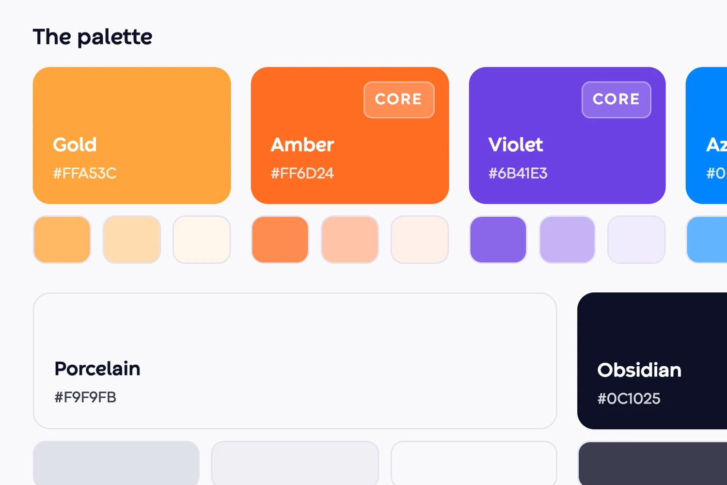
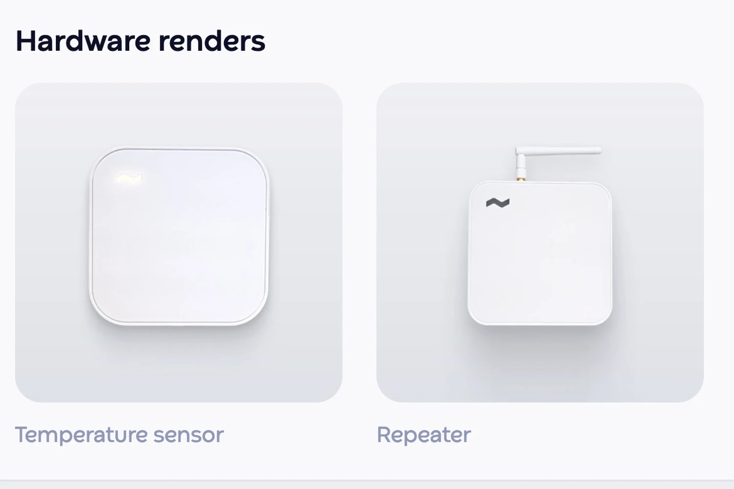
Each section states the rule and shows it working. Color names the core trio and copies any value on click. Voice pairs each trait with a real line. Imagery carries the building and hardware renders, the same set that downloads from the Assets tab.
One detail is not on any checklist. Leave the page alone and it starts to run hot or cold, tinted orange or blue, until a Runwise temperature card appears and offers to fix it. You can press the button, or Runwise fixes it on its own. It is the product's story told by the page itself, once per visit, and never for a reader who asks for reduced motion.
From a landing page to a tool
The first version, on Aug 3, was a marketing page: a big headline, a scrolling story and a button to open the brand book. It read well and did the wrong job. People come to a brand portal with a task, like finding the logo, copying a hex or grabbing an image, and a scrolling page made them read to get there.
So I rebuilt it as a tool, in the shape of the Runwise app, with an overview that shows everything at once. Then I worked it the way I work any design, in rounds, just in code. In the last two days before review I saved 16 of them, each answering one question: the grid, the icons, the type scale, headline weight, the bento layout, motion, nav order, the eyebrow labels, mobile. Saving every round as its own file meant I could compare any two side by side and drop a bad idea in seconds.
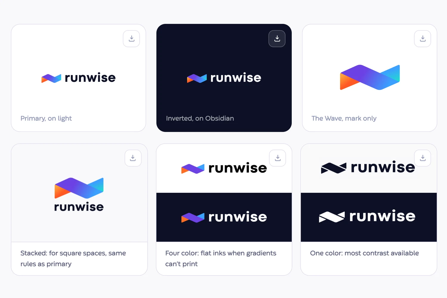
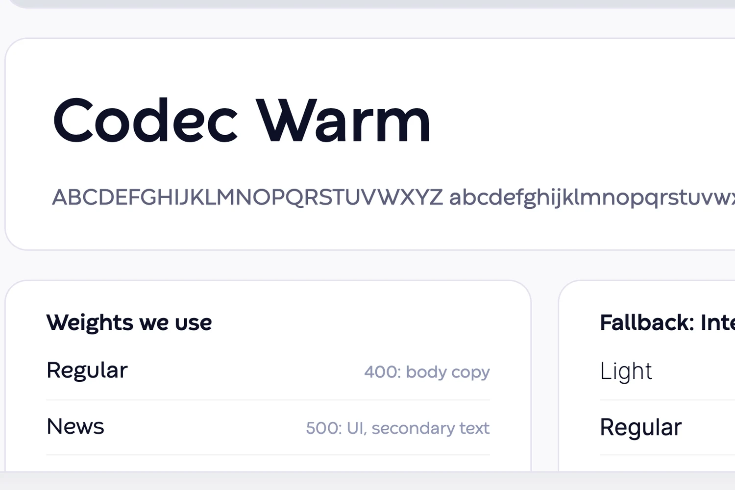
The rules that came out of those rounds now hold across the system: a few named type sizes, lighter headline weights, labels that add information instead of repeating the headline, and motion that eases in smoothly and never jumps.
On Oct 8 I shared the release candidate with the marketing team for review.
“This brand book is stunning”
“I also love how it’s formatted to look like our Runwise app!”
The change that came out of review was operational, not visual: a shared marketing inbox, so the public portal’s contact line points at the team instead of at me.
The source of truth, live
The portal went live at brand.runwise.com on Oct 12, 2026, once engineering pointed the subdomain at it. It is where anyone making something Runwise branded now starts, and where partners get sent. The first partner request of launch week, a designer building a trade show backdrop who needed 300 dpi images and vector logos, was answered from the portal’s own imagery set.
Because both sites build from one source, they stay current: change the source, rebuild, and both follow. Next, the brand system moves into a shared repository that Studio reads from too, so the agent and the portal draw from the same place.