Runwise Product Audit
I earned a product psychology certification and used it to systematically raise the craft and behavioral effectiveness of the Runwise app. Working from principles like Labor Illusion, Loss Aversion, and Feedback Loops, I shipped a redesigned notification system, branded loading states, animated temperature dials, and tactile navigation micro-interactions. I've since begun a second pass to bring the whole product to a higher bar of fluidity and polish.
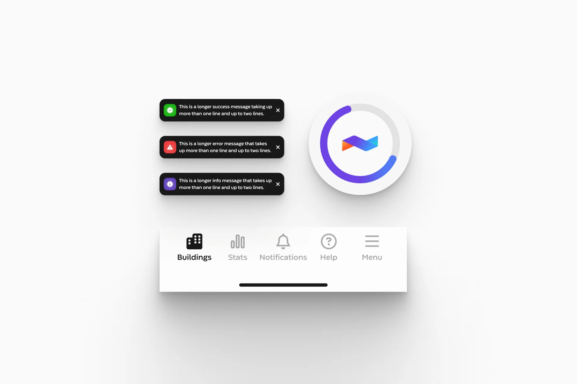
A behavioral-science lens on our own product
After completing a certification in product psychology, I ran a structured heuristic evaluation of the Runwise app: not a surface polish, but a systematic pass mapping friction points, brand inconsistencies, and missed moments against established behavioral principles.
I cataloged each issue, tied it to the principle it violated, and prioritized the surfaces where better craft would most change how the product feels in daily use. Four shipped to production; a second pass is now underway to raise the bar further. The principles that drove the work:
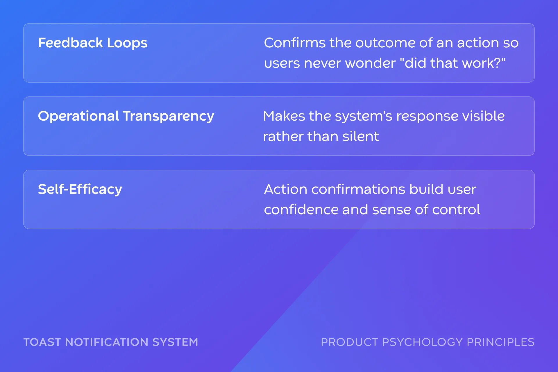
- Feedback Loops: every action should produce a clear, immediate, on-brand response.
- Labor Illusion: making system work visible so waits feel intentional, not broken.
- Loss Aversion: framing states and confirmations around what a user stands to lose.
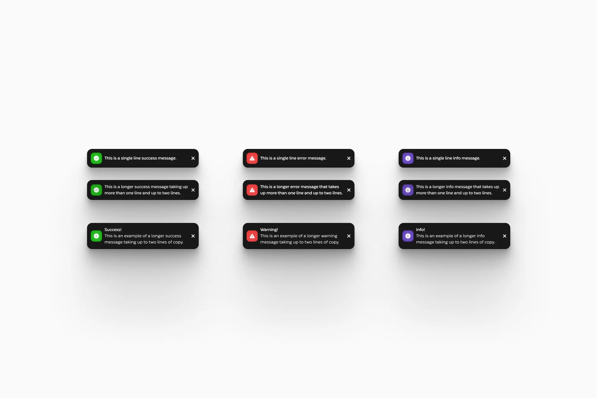
Notifications that close the loop
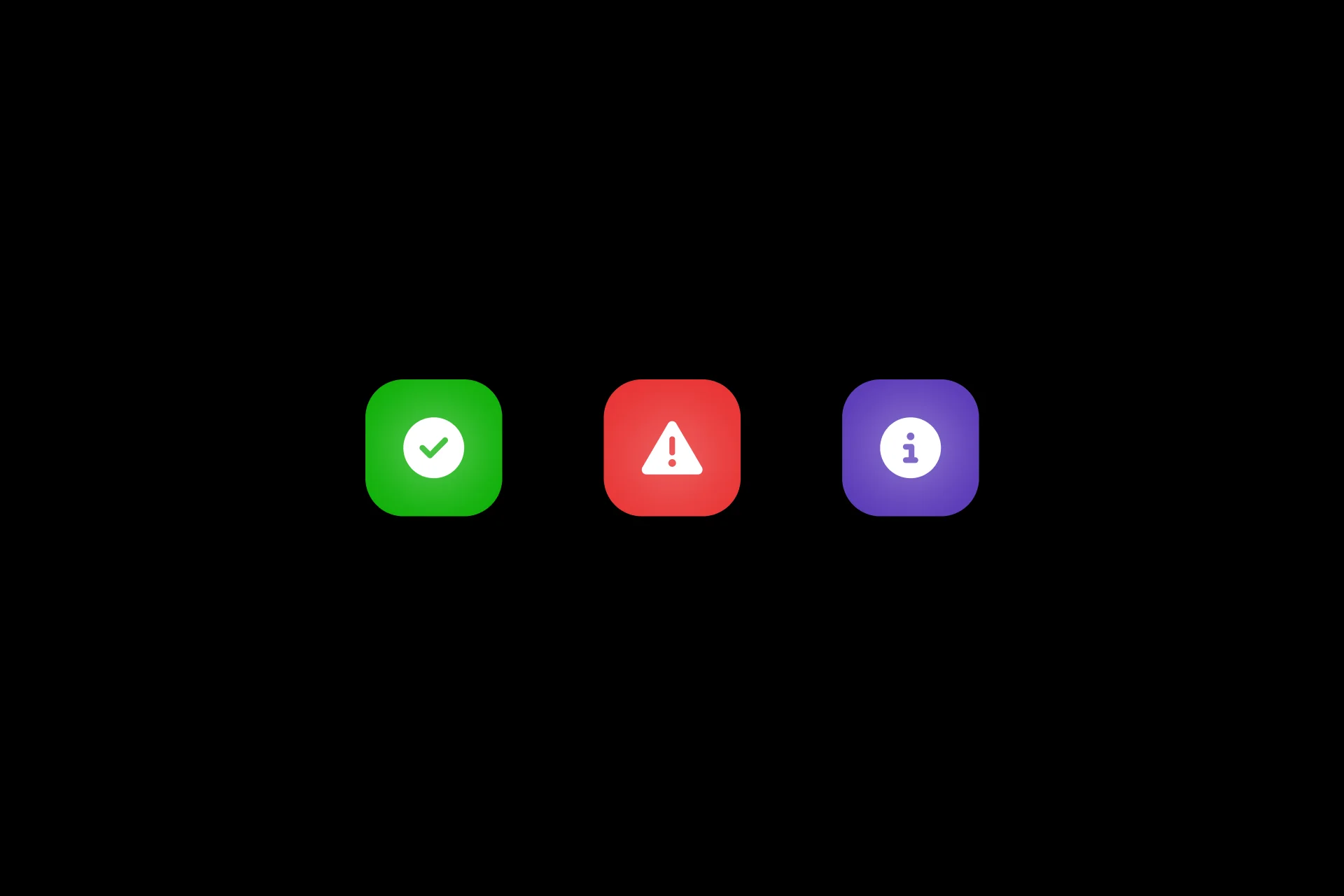
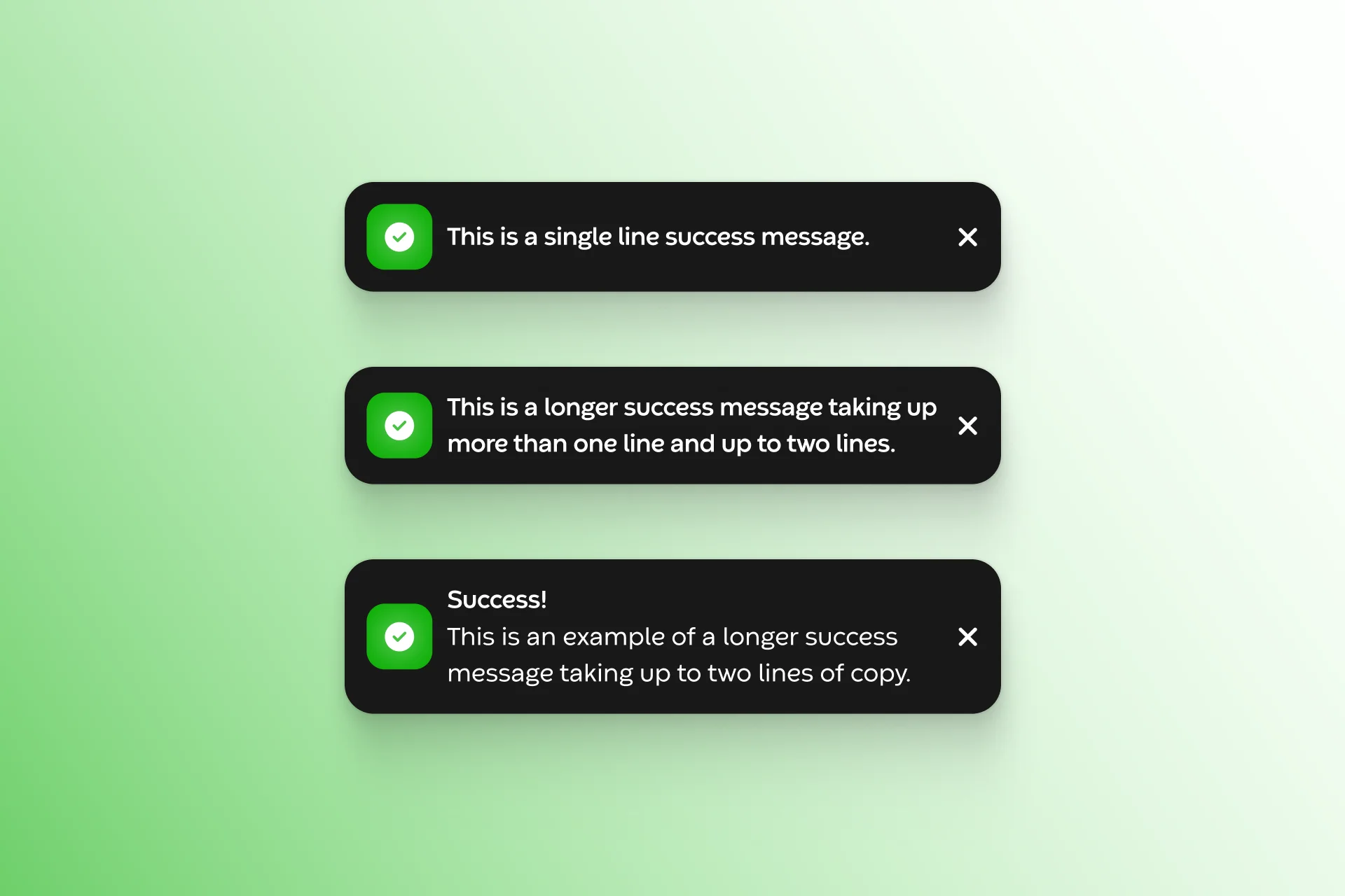
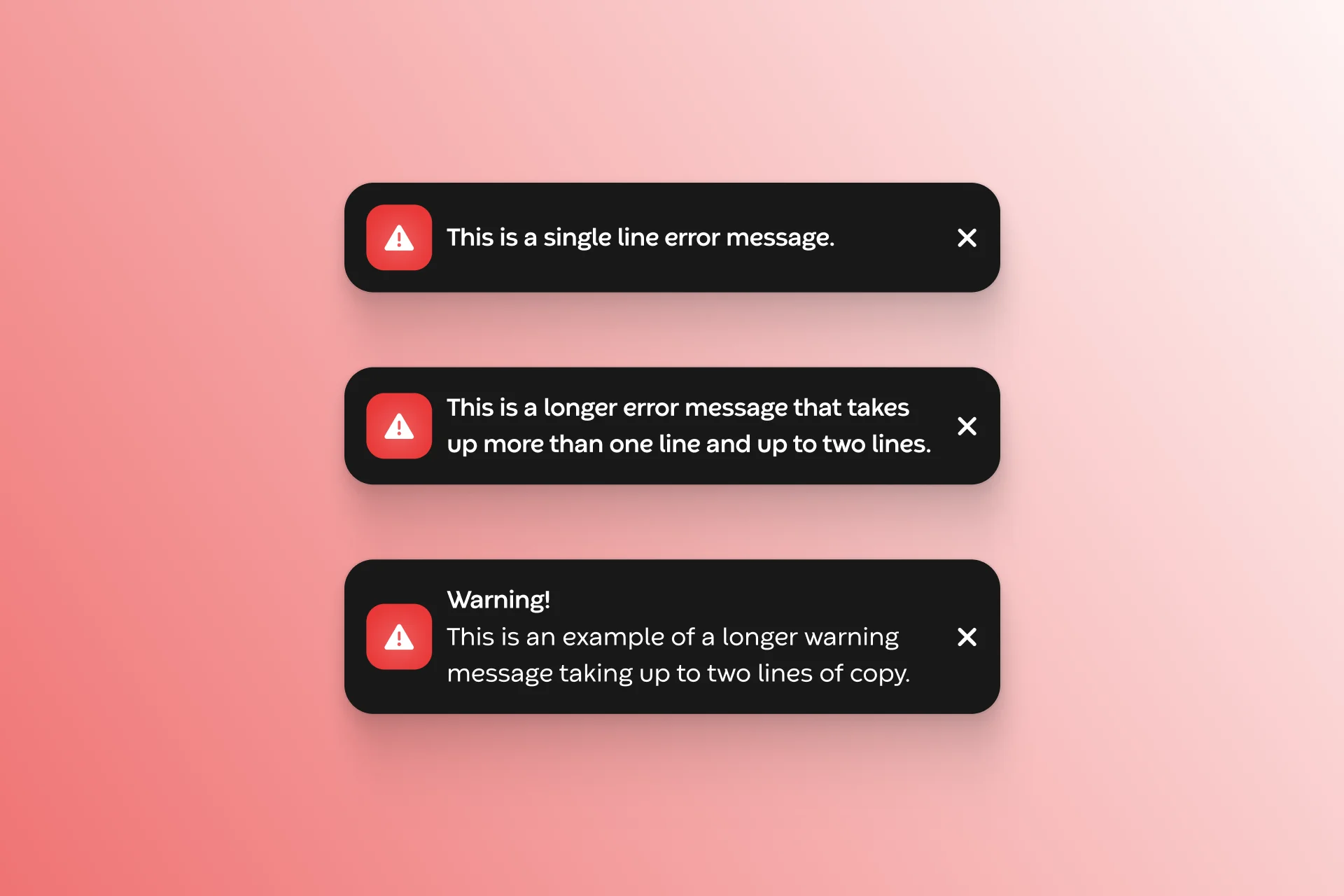
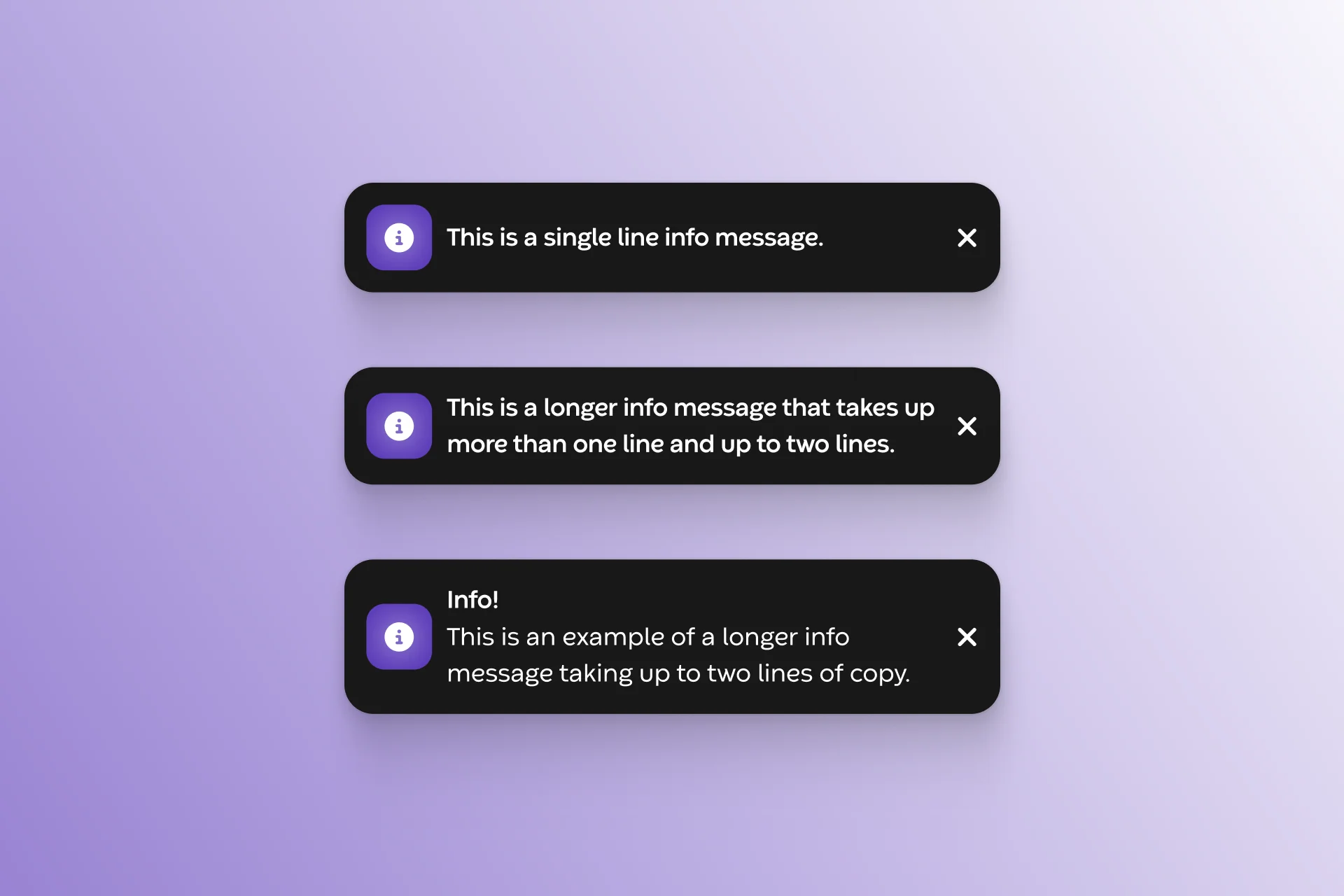
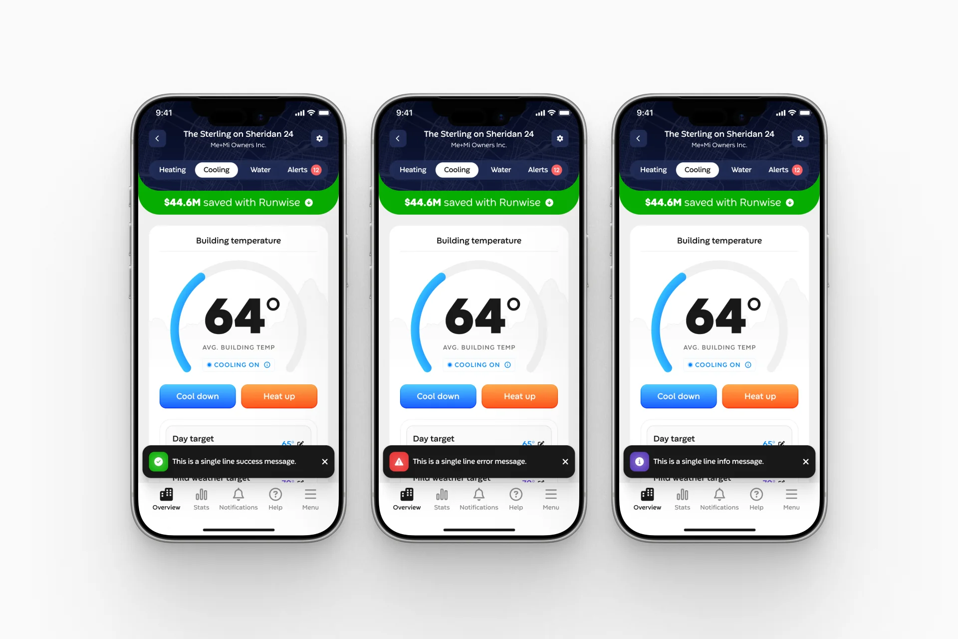
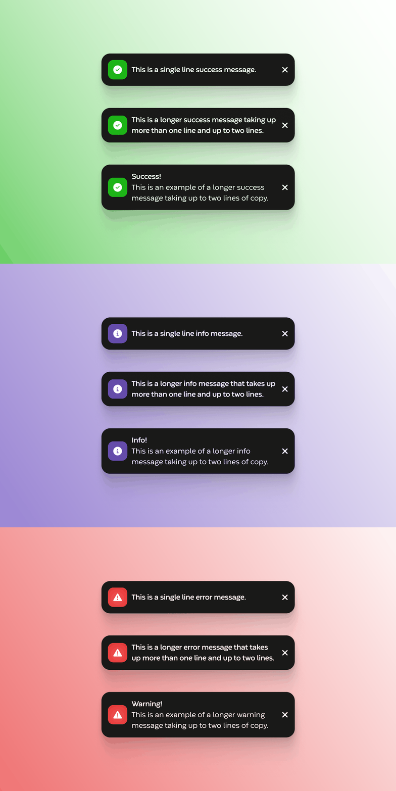
The previous toasts were off-brand, with inconsistent spacing, typography, and color that quietly undermined the product's credibility. I redesigned the notification system to align with brand standards and give clear, real-time feedback on every action, keeping users informed without interrupting their flow.
The effect: every interaction now confirms itself instantly and on-brand, closing the feedback loop the old toasts left open.
Navigation that responds to the touch
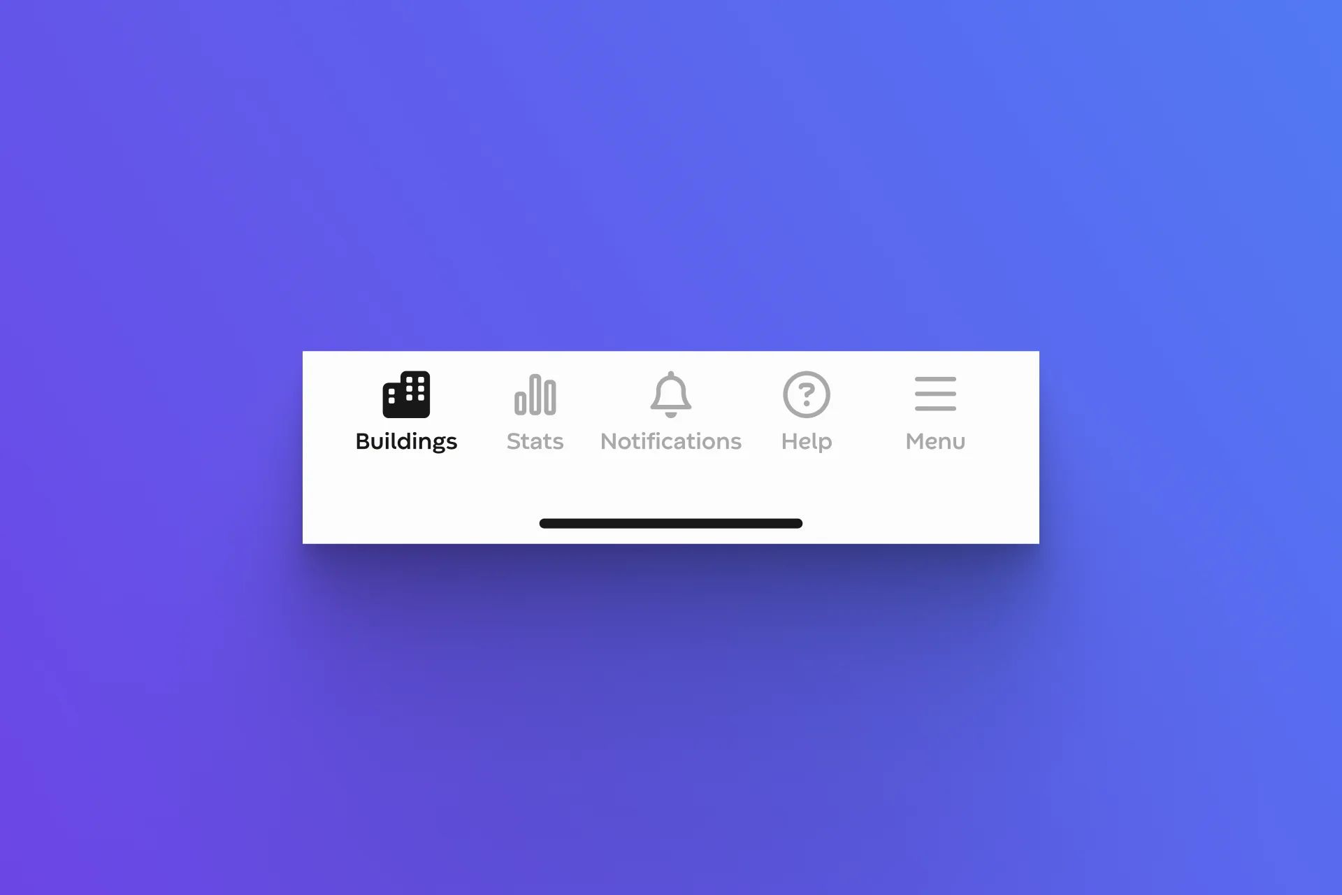
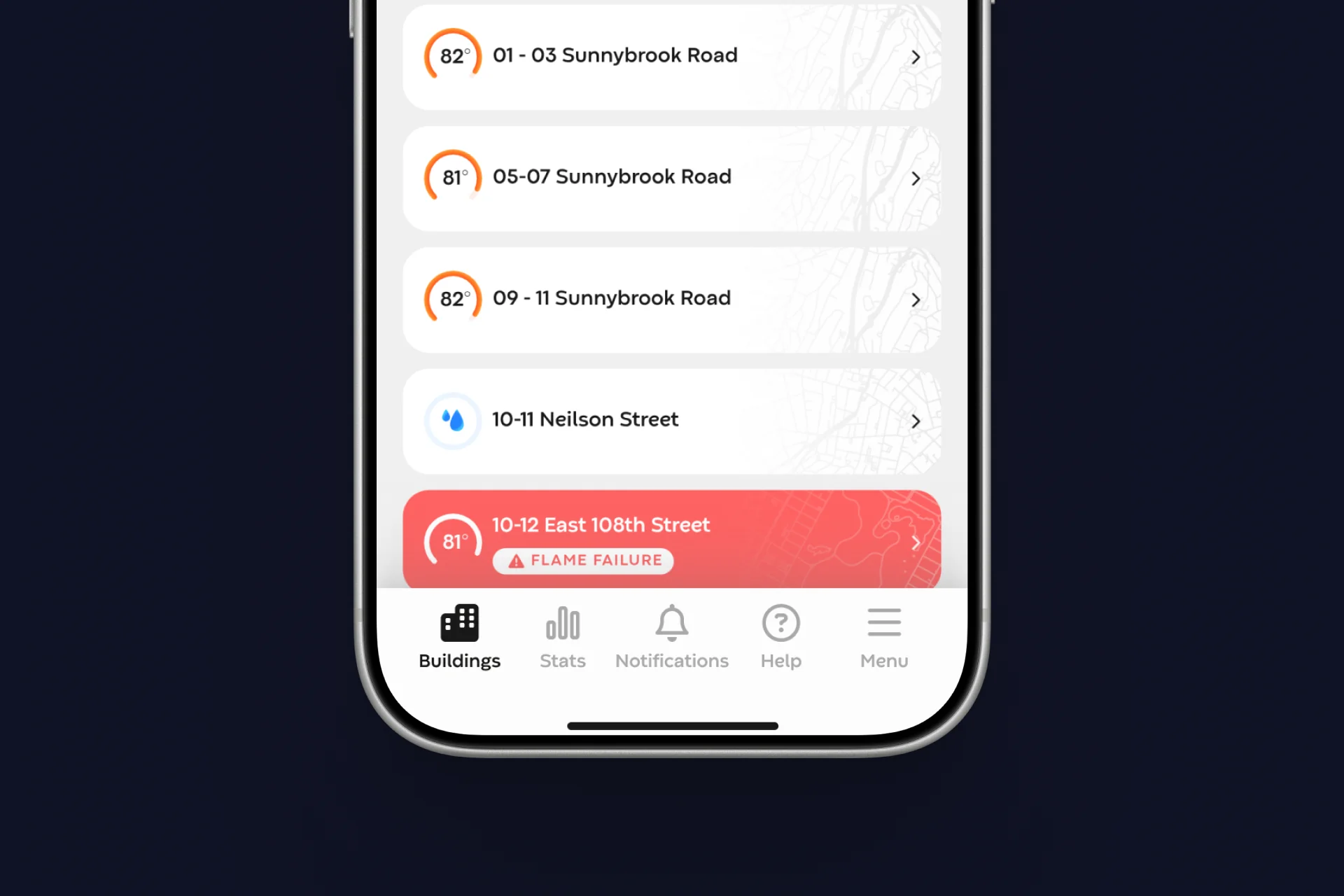
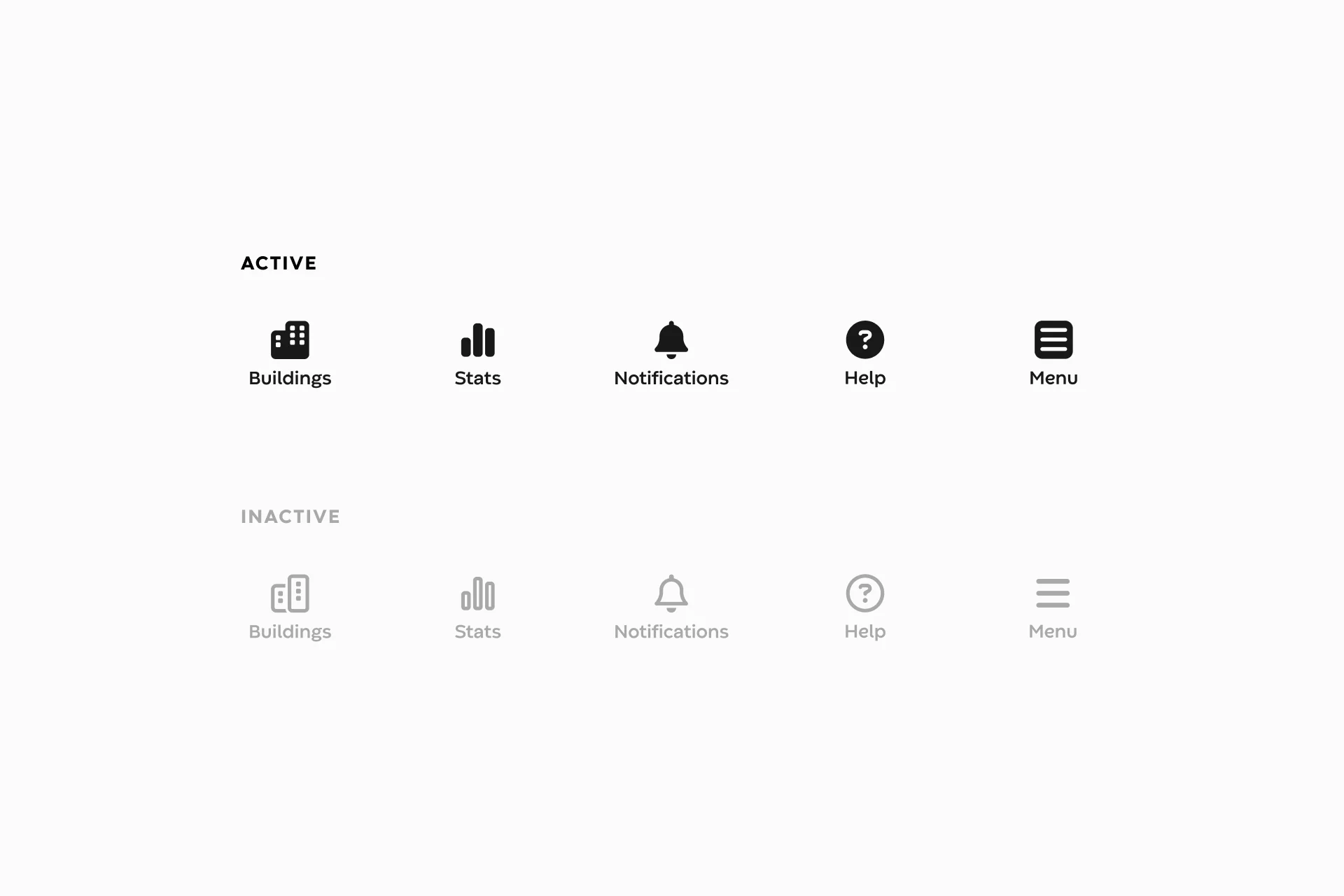
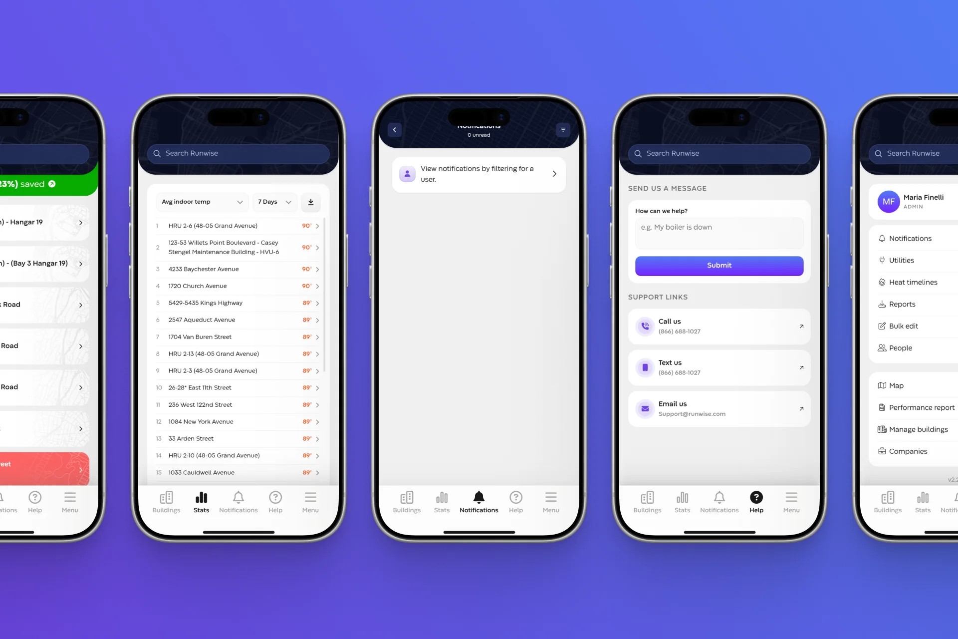
The bottom navigation had no transitions. Abrupt, instant state changes made the app feel rigid. I introduced subtle motion: a ripple on tap, line-to-filled icon shifts, and a soft pulse that make the nav feel tactile and responsive without ever drawing attention to themselves.
The effect: taps now feel acknowledged and physical, turning a purely functional bar into one of the app's small moments of delight.
Loading that feels intentional
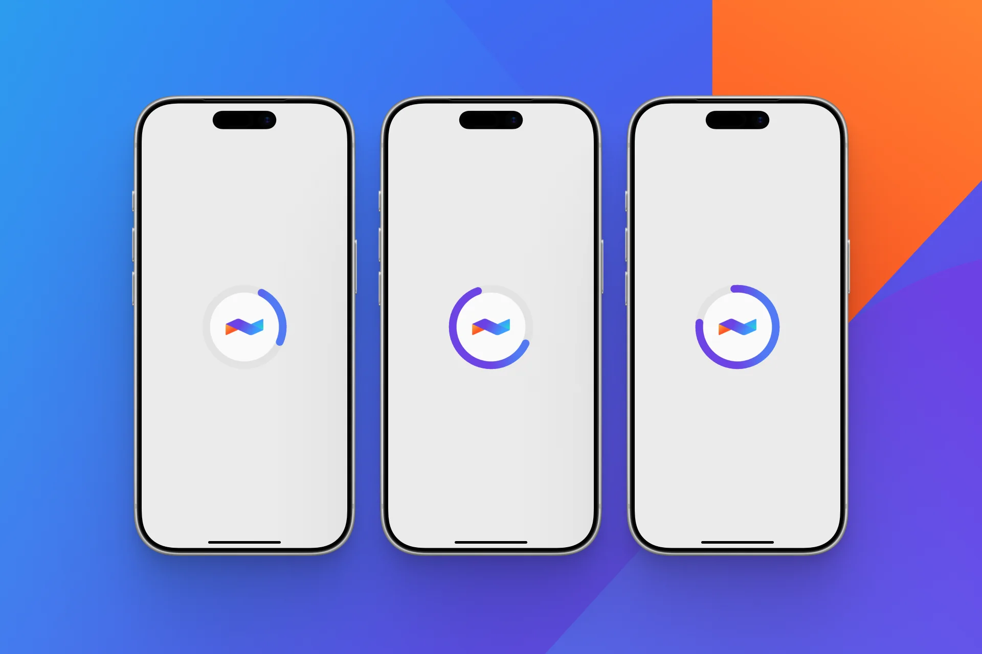
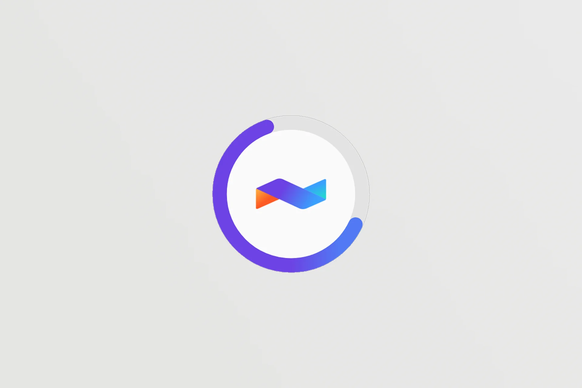
The original loading experience was a generic gray spinner that made the app feel broken or unresponsive. I designed and tested multiple branded logo animations, working with engineering to ship each variation in-app and identify the strongest performer. The final animation makes system processing feel deliberate, the Labor Illusion at work, so the same wait reads as the product doing real work rather than stalling.
The effect: the same load time now feels purposeful instead of broken.
Dials that take a live reading
The average-temperature dial is the first thing an operator sees on the Overview and building pages: the product's vital sign. It used to simply appear as a static number, easy to skim past and impossible to distinguish from a stale reading. I animated it so the arc fills as the number counts up to the live value, the way a gauge takes a measurement.
The effect: the page's most important number now announces itself. The motion anchors attention on the reading, and the act of arriving signals that the data is live, not cached.
What shipped, and what's next
Four systems went to production: the notification system, navigation micro-interactions, branded loading states, and the animated temperature dials. They became the app's new standard for how interactions feel. The work was well received by leadership and reframed craft and behavioral rigor as something the team actively invests in.
I'm now running a second pass, bringing the same behavioral lens to the finer grain of the product: the timing, easing, and continuity of transitions and micro-interactions across the whole app, so motion feels soft, fluid, and cohesive from end to end.