Datadog On
The engineers at Datadog needed a new design of their multi-page website used to house an ongoing series of episodes in which they could discuss and demonstrate the many features and products available to them as they build and monitor the Datadog platform. They also wanted to make the subscription user experience much clearer to increase sign ups and expand their audience for these episodes. I built this design to encompass all Datadog On… episodes and speaker information with an intuitive, branded visual language. Below is the complete user experience redesign for the “Datadog On…”. website.
Role
UI & UX design
Interaction design
User research
Visual design
Tools
Figma
Hotjar
Company
Datadog
Datadog On design walkthrough
Datadog On home page design for desktop and mobile
The original website had a ton of issues to solve for. The biggest one was that the content did not appear available and free for all users. The registration process came off like a purchase which was warding off users from viewing the content. The UI also did not feel like it belonged to the Datadog brand and the nav bar was full of unnecessary items. It would also become partly hidden when a user was “logged in.” The restrictive template being used also included comment and upvote functionalities that weren’t being used but appeared by default.
The Challenge
(Left to right): Updated design for speakers page, individual speaker page, and episode page
There were also numerous steps a user had to take to get to an episode page to actually view the content. Below is the sitemap and user flow for the previous site.
Previous sitemap
Previous user flow

Previous home page

Previous episodes page

Previous speakers page
Pain Points
Very restrictive template
Comment and upvote functionalities are unwanted but appear by default
Styling should be closer to the core Datadog brand
Navigation bar is extremely full of items and part of it is hidden when a user is “logged in”
Content does not appear available and free for all users - registration process comes off like a purchase which could ward off users from registering
“Datadog” is the company name for all speakers and is shown several times unnecessarily
New sitemap
New user flow
Adjustments
Simplified the nav bar (consolidated pages, removed unnecessary ones)
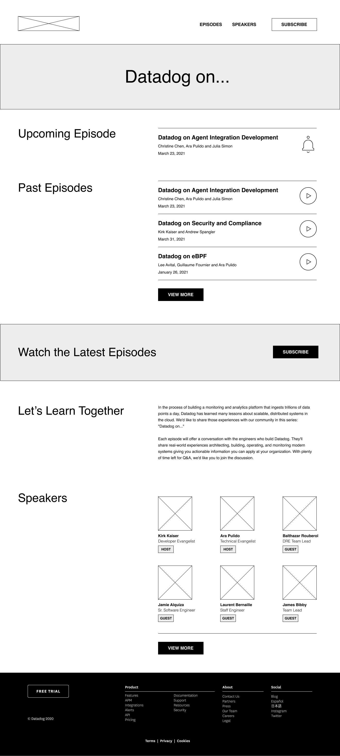
Reduced amount of episodes and speakers shown on the home page (3 past episodes, 1 upcoming episode, 6 speakers) and added a View More button for the user to expand further
Created a stronger visual differentiation between host and guest speakers using color coded tags
Featured the newest episode at the top for maximum visibility
Removed the email input fields for past content to ensure it’s ungated
Changed the language around signing up from “register” to “subscribe” to avoid connotations with purchasing or buying
Kept the ability to filter episodes by category

Home page wireframe

Episode page wireframe

Individual speaker page wireframe

Speakers page wireframe
In order to solve for all of the issues I ran into while I was gathering feedback from users, I proposed the wireframes above which simplified the nav bar, reduced the amount of episodes and speakers shown by default, created a visual differentiation between the hosts and guest speakers, featured the newest episode at the top, removed the email input fields to access past content, and changed the language around signing up from “register” to “subscribe” to avoid connotations with purchasing.
The Solution
View more projects
Datadog Documentation
Webinar Hub
Datadog Summit
Datadog API


